Old Design
The listing flow is one of the most crucial areas of classified experiences. It is used by individuals and businesses alike to add vehicles to the platform. Although we were having a redesign of the entire flow.
The premium flow is one of the most critical phase of monetization for the platform. Users can upgrade their ad to any of the premium offerings which would boost their position in the overall listing and other benefits.
Quikr
UX, Visual design, UI
Aug '16 – Sept '17
www.quikr.com
Add premium offerings flow to mobile and make it scalable to add more offerings. Also iterate continuously to see what works and what doesn't
We saw good adoption my first time users as were able to explain our proposition in a better way. The redesign allowed us to add more premium offering. A responsive code that works both for desktop and mobile.
Do repetitve A/B tests to test the new design and improve it iteratively. Keep in mind that a lot of users are first time individual(private) users who would be selling for the first time.
By the time we had rolled out the the final post ad flow the increase in overall revenue had been 107%
The main aim was to boost the overall revenue for premium upsell flow. As we were scaling the new seller's listing experience the older msite didn't have premium upsell flow.
As we had boosted the conversion rate for the listing if we can just add our premium upsell flow there would have been a 15% boost in revenue by premium upsell flow.
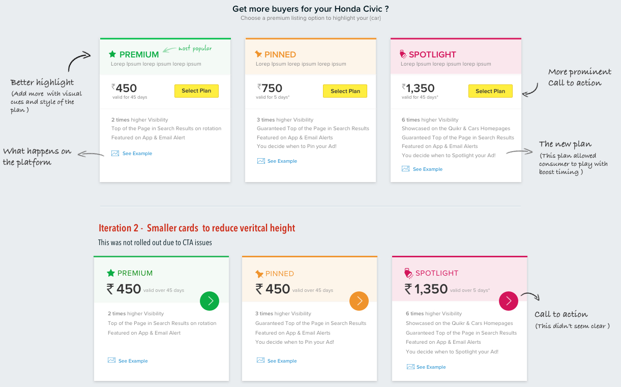
Later on, the new flow was expected to handle the increase no. of paid offerings options that the product was now able to support (3 in total versus 2 at the beginning of the change).
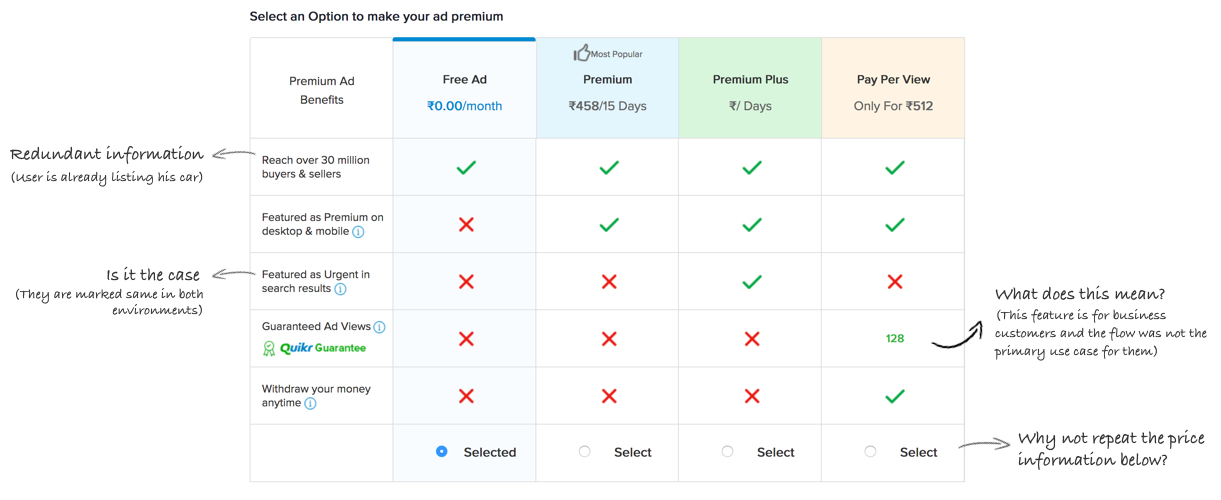
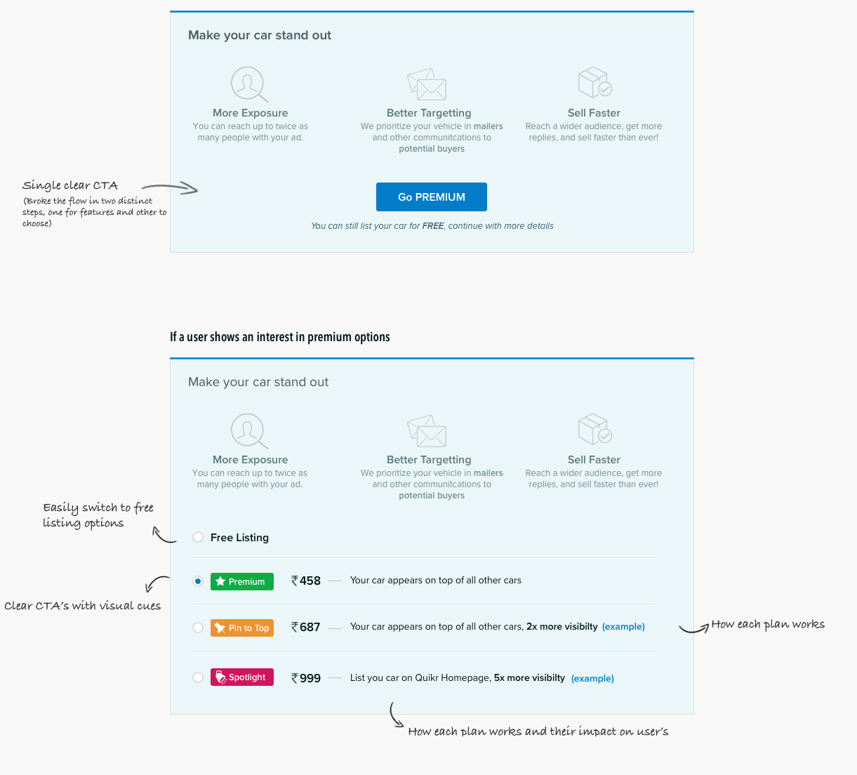
The status quo iteration was having a simple comparison grid showcasing the relative advantages/disadvantages of the various paid listing options.
We didn't want to have a revamp the overall design hence we initially added the older desktop flow to new flow and iterated over the design later. There was an increase in desktop conversion but not as per the expected results. Before moving to the design process I evaluated the current design. The current tabular design already had many usability and product issues as highlighted. The design was more inclined for business/power users, also some UX issues limiting to first time individual customers there:
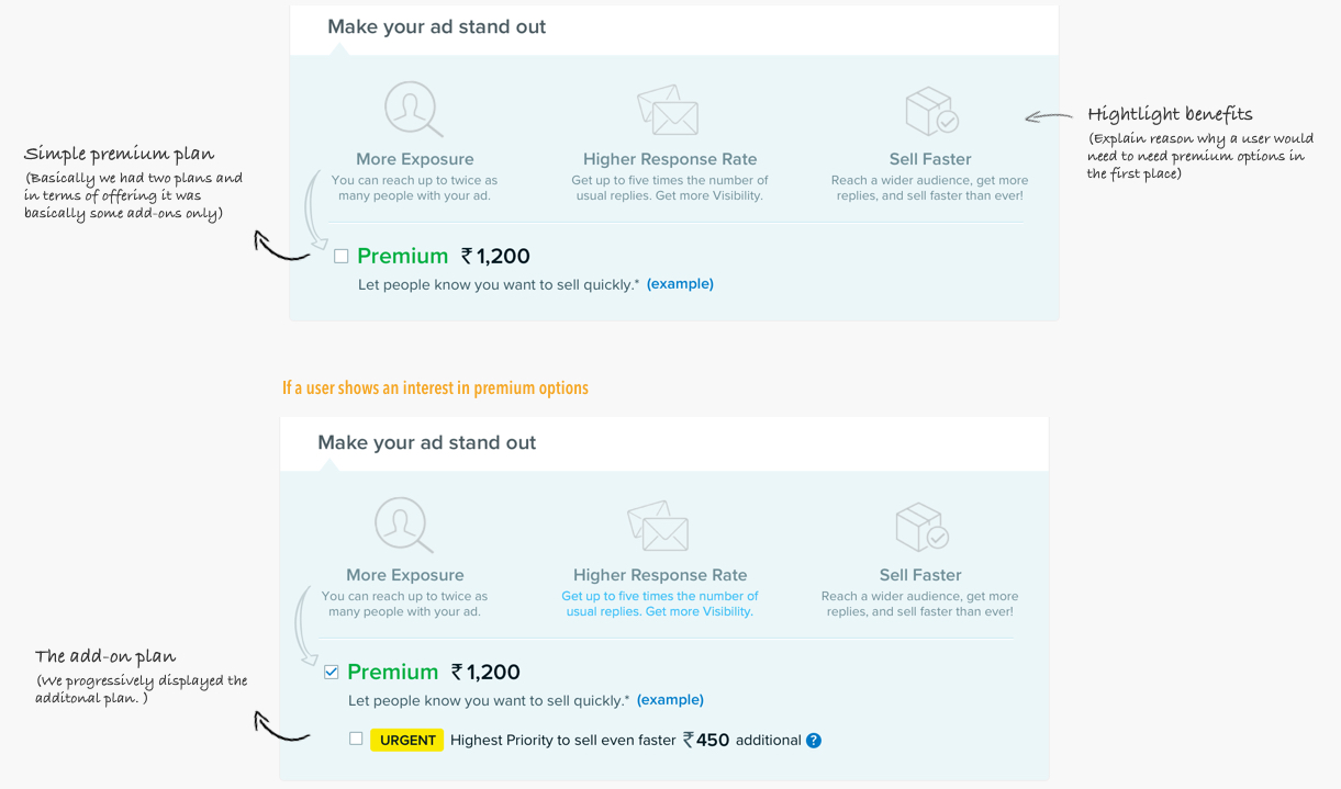
There were some iterations of the tabular design but they were eventually dropped. We then decided to test the current layout with a new design which highlighted the feature of the premium program in general and how we boost their listing.
Even though there was an increase in the overall conversion but the upside was not statistically significant. There was no actual conversion difference between the desktop design and the new mobile site flow started contributing (in a much smaller way). We persisted with the new design as the current mobile site didn't have a premium flow and the new UI was working well, eventually we had to revisit the decision when new plans were added.
Later iterations were needed to accomodate new plans which were slightly different that current design. Also we were trying different plans hence we needed a scalable solution. Also the increase in conersions was that significant as the the control version didn't had the premium section.
We still thought that there was scope in improvement on our progressive presentation of our offerings.
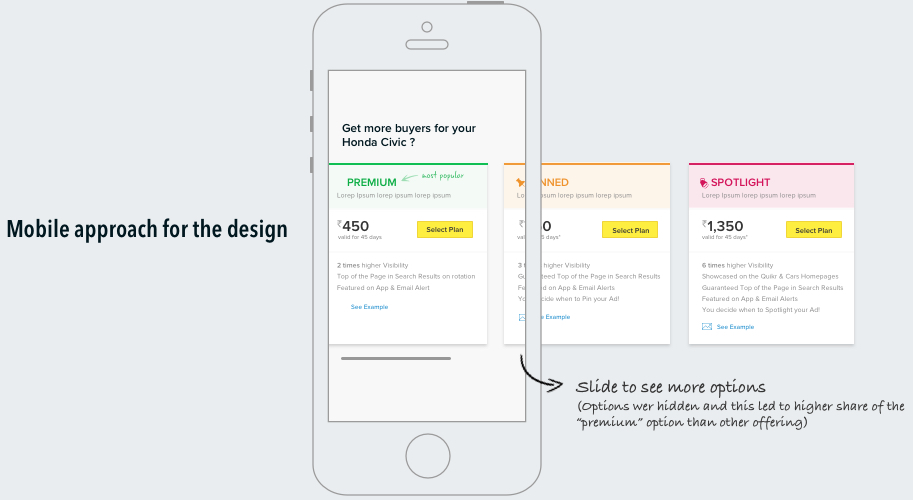
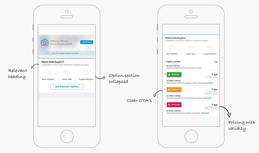
We further iterated simply on the background color of the section in mobile and switching the CTA from a primary action button to a secondary action button to avoid confusion. This further improved the conversions for the mobile flow.
As the overall listings grew increase by 15% there was expected increase in revenue generated by the premium flow. Post the release of the last design the overall revenue generated by the flow was around 107%. Also side-by-side I did user research for the user flow to also improve the product State based pages and fetching real-time browser location to have a better matching in buyer experience.