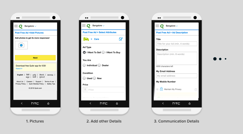
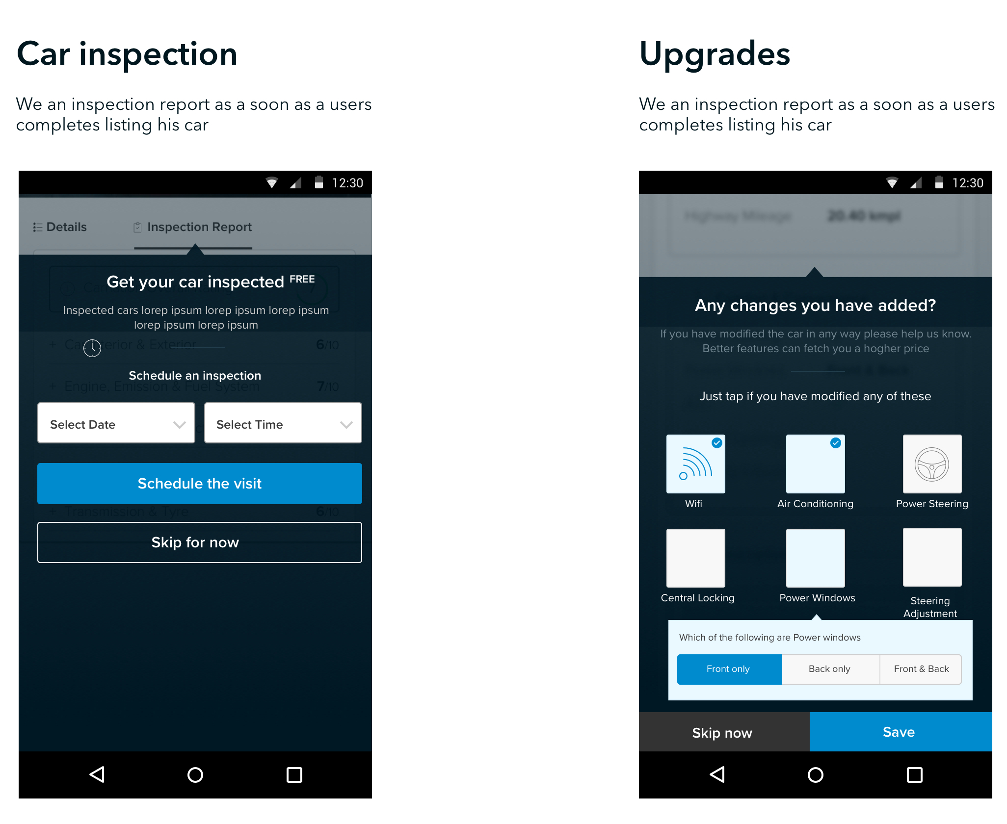
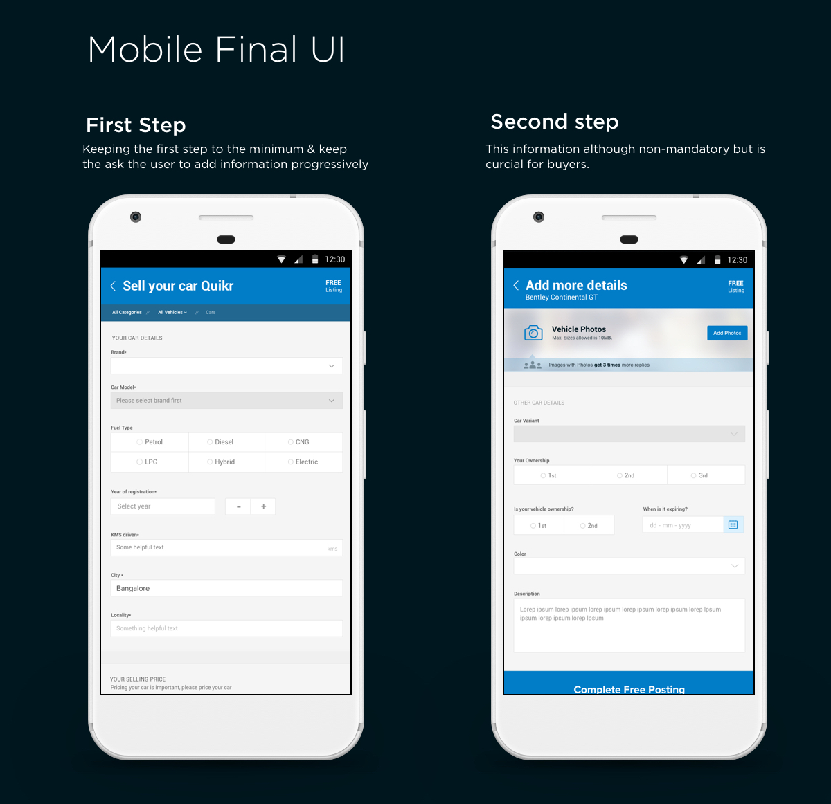
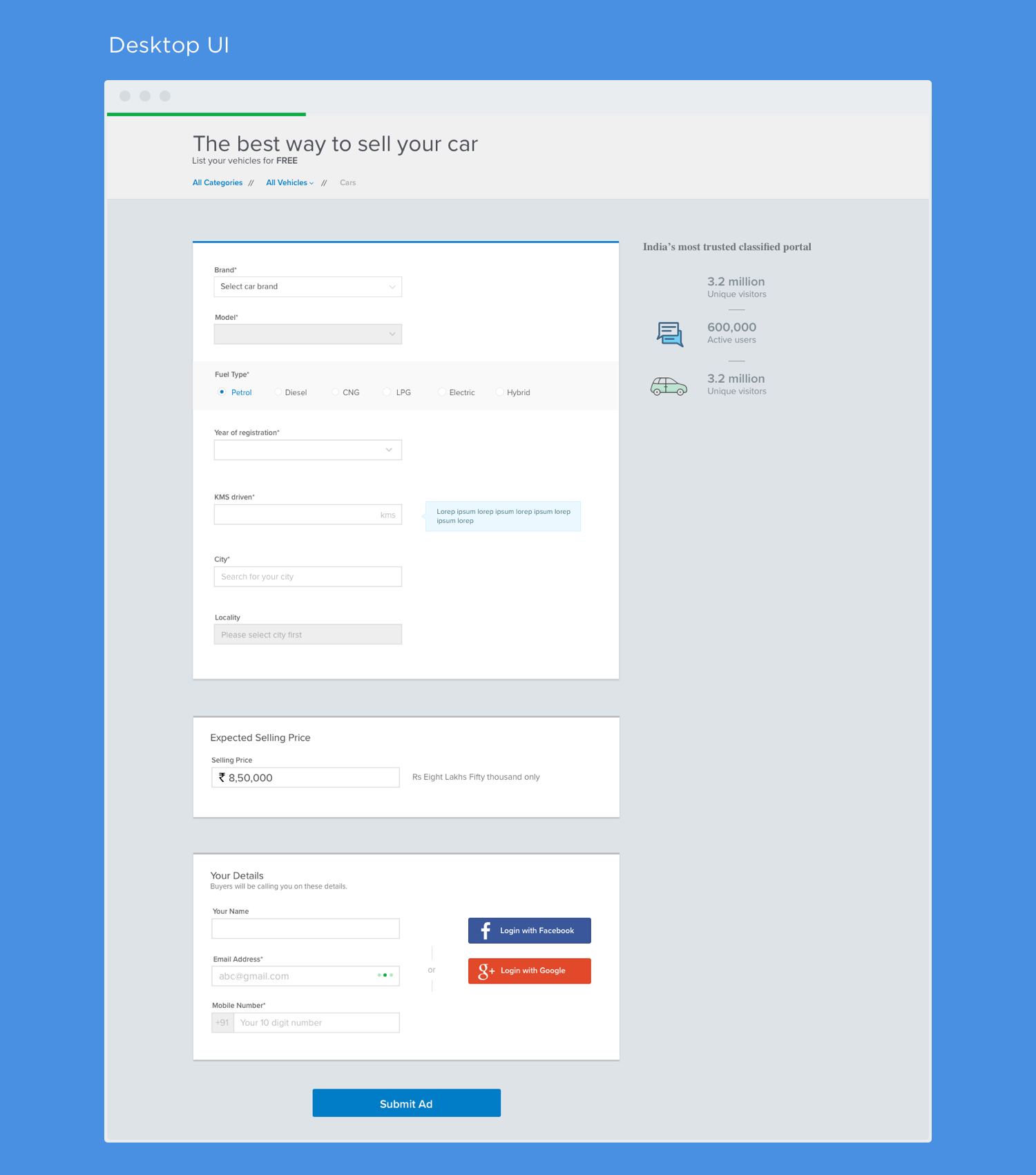
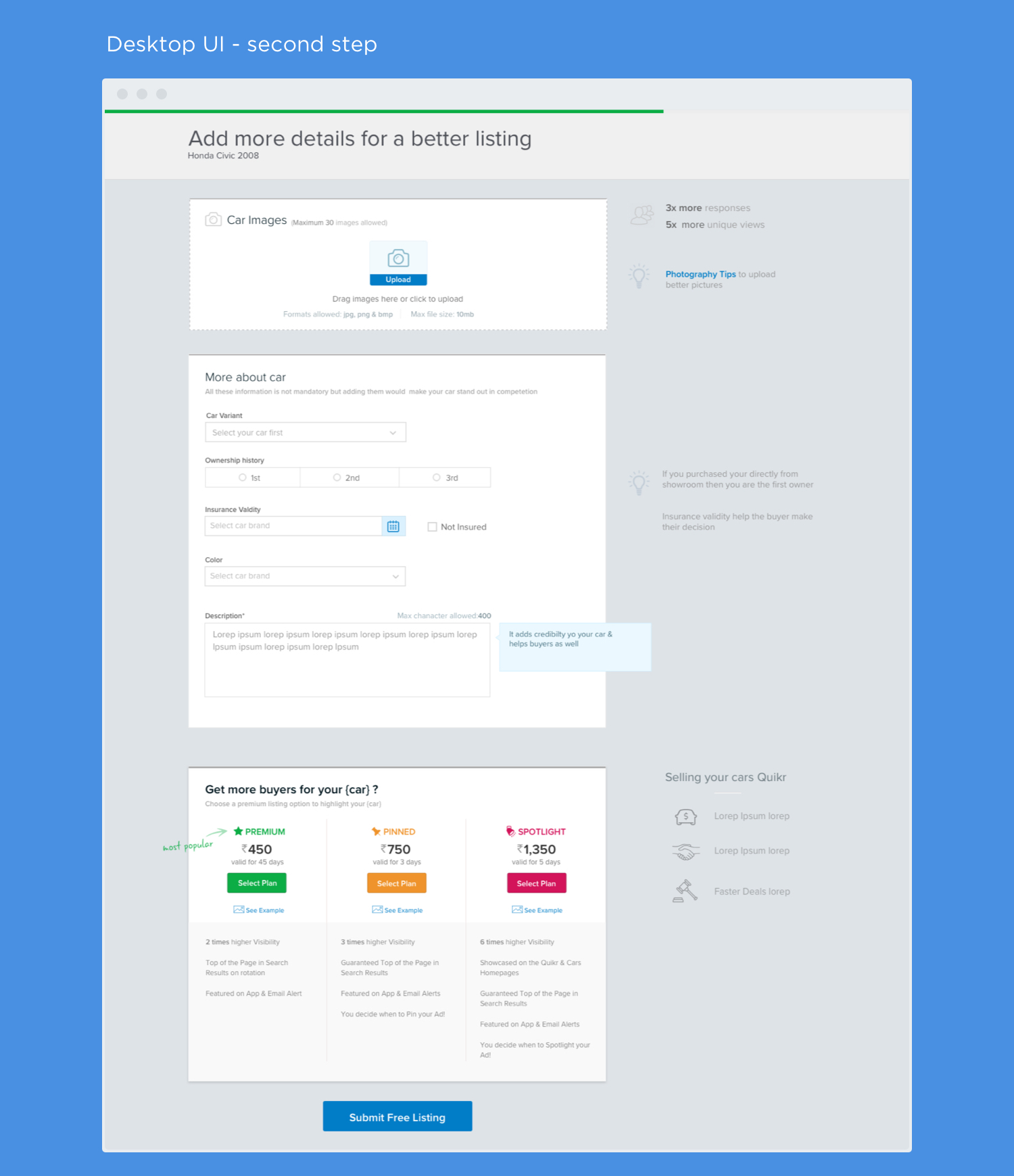
Our post-ad pages are place where user would place their used vehicles on the platform. We currently had a separate desktop and mobile experiences. The process was iterative ones and we did usability test and conducted user interviews in each cycle to come to the best possible solution. I have broken the flow in design in Desktop and msite to highlight the design process.
Quikr
UX, Visual design, UI
Sept '15 – Ongoing
www.quikr.com
Before proceeding further I would like to elaborate that we initially had a separate mobile site(msite) and desktop flow. Desktop was largely better performing than msite but as we had witnessed a gradual but steady increase in out msite traffic hence we needed to focus on the shifting pattern.
Our mobile flow was broken in 3 steps: image upload followed by user details and car details. There was a significant dropoff in each steps and as a result the overall conversion was poor. A lot of information asked was not required and some were outright obvious and due to some legacy reasons they were kept.
As mentioned before we already have a generic flow that caters from Real-estate, jobs, cars and pets. It began with a simple craiglist like approach but soon balloned into a giant single page form.
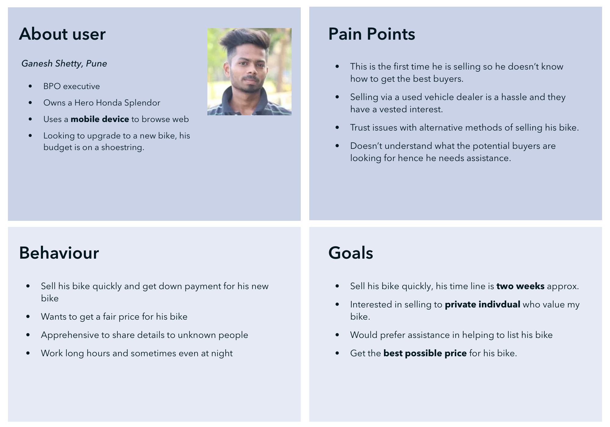
Our initial user reseach was limited to usability evalutaion by fellow designers of the current flow and user interviews(telephonic) of users who either uploaded or tried listing their cars on platform. This helped us determine the current set of issues users are currently facing. Later on I started listening customer care calls to find issues
In the redesign we were more focussed on Individual sellers as they were facing the main issues and there were other method(via CMS tool) from which they can list their cars. Also car dealers were listing vehicles via android/iOS app or via Desktop. Also whatever improvements we make here would be passed to car/bike dealers.
In India, a lot of folks have mobile as the primary device to connect to browse the web and hence the mobile users were distributed all across; significant car sellers are from smaller cities or towns.
As mentioned earlier due to legacy issues we were using form element in a very inefficient manners. We improved the design in an agile method where we reached the final design by tweaking the design over time and getting constant feedback.
Post our user research we narrowed the user problems on priority level and thereby tried to tackle issues by priority. Certain problem we had to scope out due to tech constraint or platform constraint, such as the edit flow had to be done via legacy method only even though it came across as a critcal issue for us.
Urban users were apprehensive about sharing there details to random users. Also most complained about spam calls that many people get. We added a feature that allowed users to hide their mobile numbers and could share it via chat or sms if the seller thinks the potential buyer was genuine.
We wanted to ease users in making the selection and we wanted to avoid big dropdowns and input that users needed to fill. The dropdowns were searchable but they users can select their car more easily as we populated common option for him.
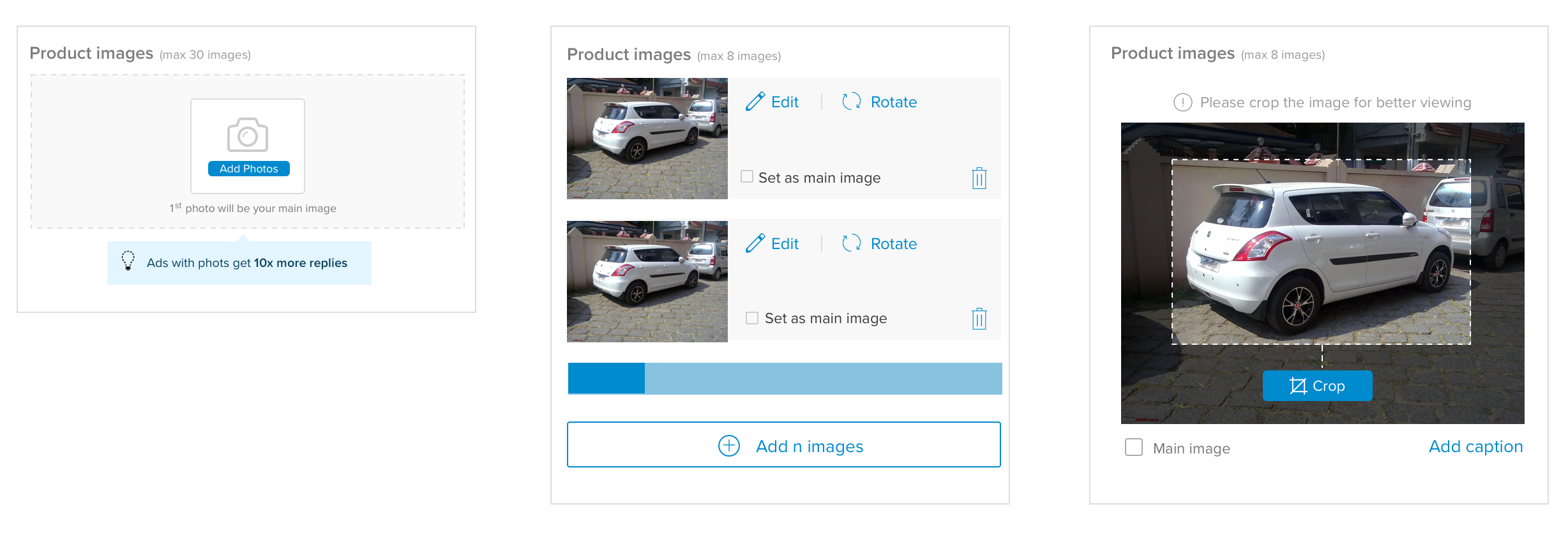
Image upload was the section with most hassle, in the conginitive walkthought a lot of users complained that they had no feedback what was happening during the image upload. There were tech issues as the mobile got hung up in the upload process.
We in our final approach decided to use an image compression on client side via JS to reduce the image what was being given to us. In the design part to optimize for the buyer UX we wanted a consistent landscape images.Also suggested a link like what kind of images should the users upload and order of images.
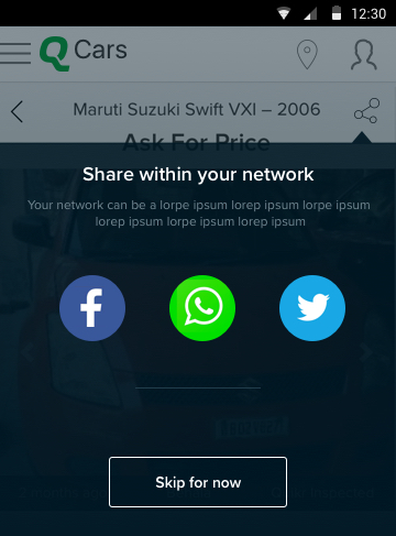
A lot of urban users increased the buyers by sharing within the network and these buyers are generally more trustworthy and understanding. Also suggested listing their ads of group like Flat and Flatmates could even help sellers leveraging their network. Also on a plus point most of the these boards are individual buyers.