Changes in Information architecture

SlideShare premium features were released in a planned manner to all users. It was well recieved by users and covered widely by media.
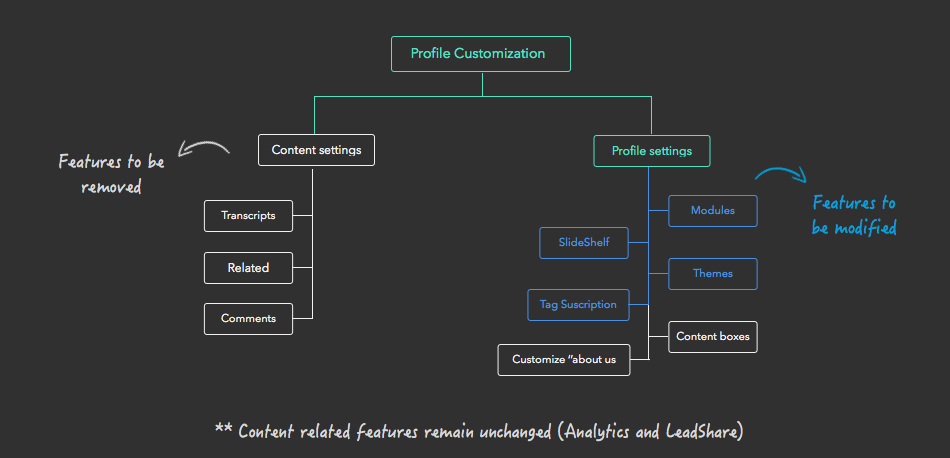
As it was a planned release in a phased out manner I had tp plan out all the navigational changes and also work on the in product communication plan. Also as there were many existing users on various plans we had to migrate them in a planned manner to ensure their overall experience is hampered.
SlideShare
Information architecture, Visual design & Marketing
Jan '14 – Mar '14
www.slideshare.com/features
SlideShare decided to axe its premium model and roll-out all the PRO features to all users. But as we had many users on various different plans and to compound that isssue many were on monthly/yearly plans; we had to plan out the implementation cautiously.


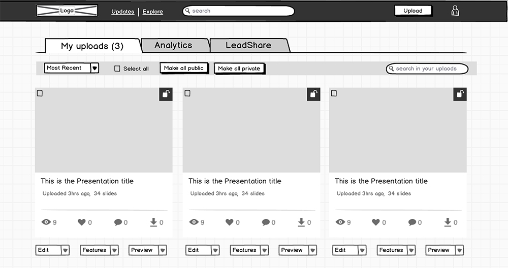
The design plan was shared with the design and product team. Also discussed the various mocks/sketches at various stages; also tested the low-fidelty mocks internally. The deisgn pattern on sub-navigation was borrowed from list pages. Kept the deisgn minimalist and ensure the focus is on the features.
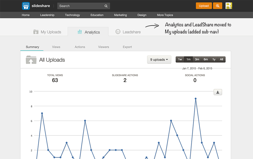
The primary reason to move them to my uploads was that it already houses the author's content and all the features are related user's content. Apart from that the myuploads page is a frequent visited page, hence users would discover these features easily, free and PRO alike.
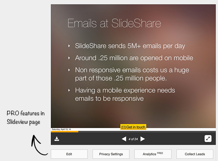
To ensure that all free users will have a consistent UI we move the PRO profile settings to the user account settings. Also we planned to move all the profile related setting to User profile page at a later stage when we redesign profile (ongoing development). Created a new design pattern for the side-menu (no visual feedback of the selected state).
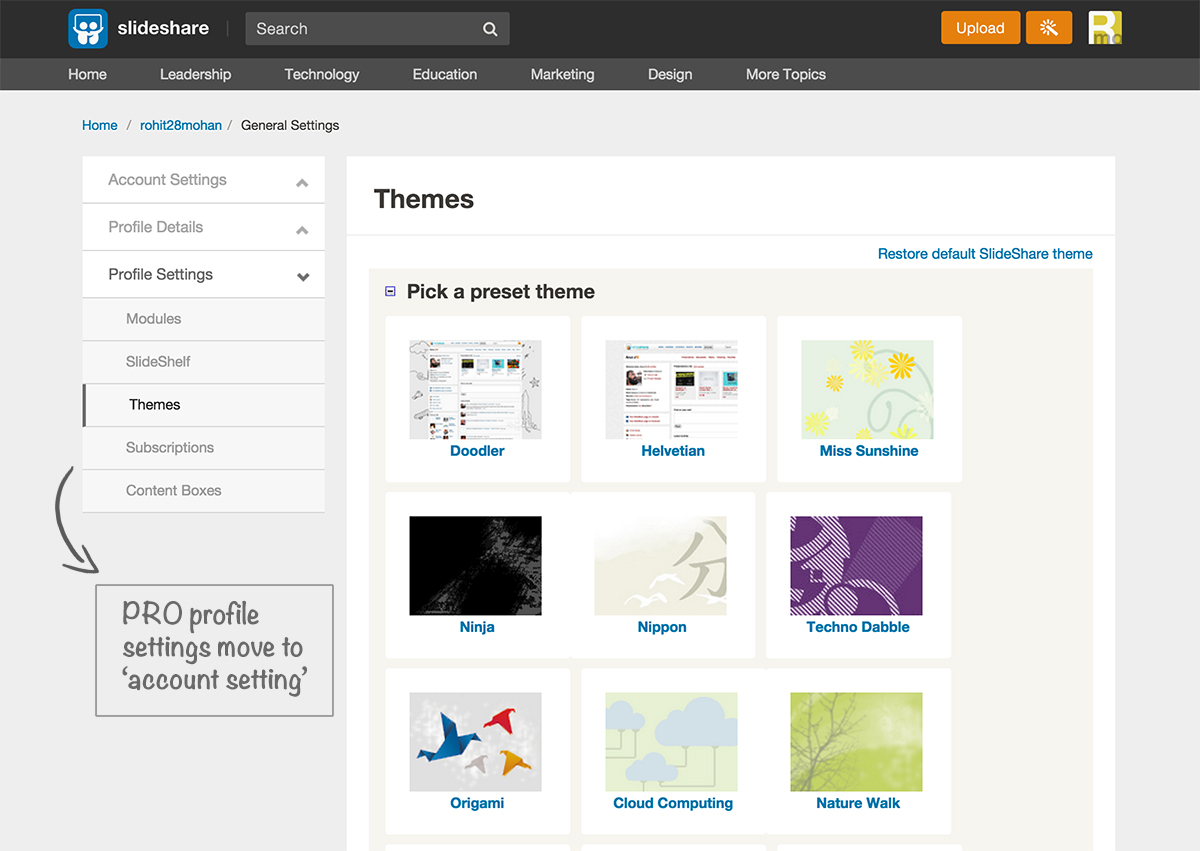
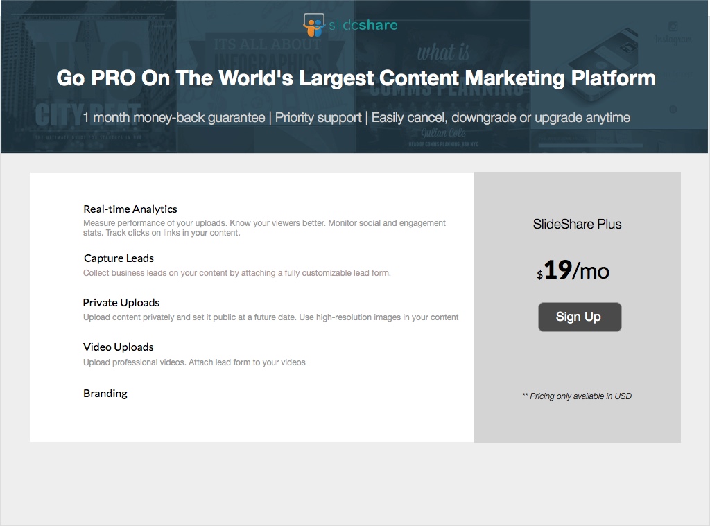
SlideShare PRO was discontinued in a step-by-step manner, beginning with yearly plans followed by the monthly plans. Also the renewals/subscriptions were handled in a similar manner. Also had to change the upgrade/downgrade loops to ensure smooth transition for existing users.
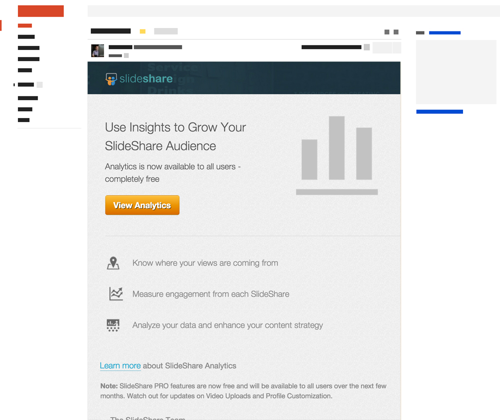
I was involved when we released analytics launch to all users. We already had moved the analytics section to My uploads section, so that the existing users are already aware of the UI changes. There were minor cleanup tasks in analytics sub-navigation which I mocked up and implemented.
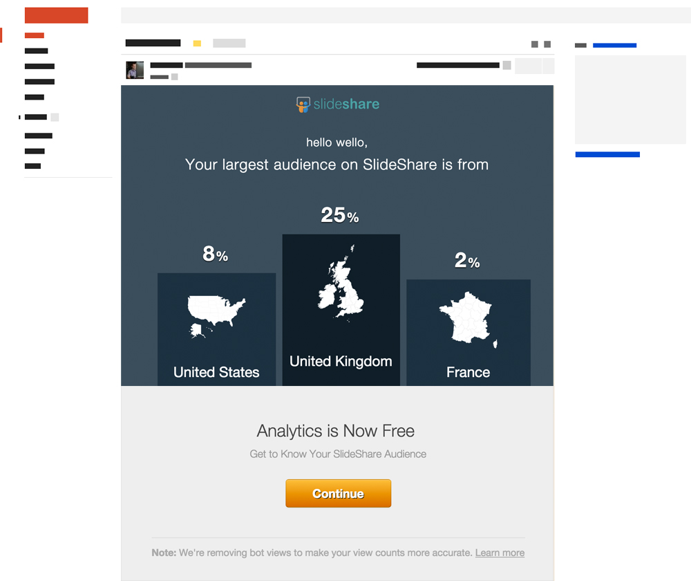

There were many users who didn't have data such as top countries, views and other data; so we gave a simple mail highlight the key USP's for SlideShare analytics.
We had a overwhelming response from media and well as users. It was widely covered on social media and widely appreciated by users.
LinkedIn's SlideShare axes its freemium model
http://t.co/bwh1FYhRGn
— TechCrunch (@TechCrunch)
August 25, 2014
LinkedIn’s SlideShare goes completely free, will slowly release Pro features to everyone http://t.co/ukUtGMoD9F by @nisummers
— The Next Web (@TheNextWeb) August 20, 2014#LinkedIn’s #SlideShare goes completely #free, will slowly release Pro features to everyone http://t.co/M2e4BzxJBj by @nisummers
— Hugues DHF (@huguesdhf) August 20, 2014How awesome: #LinkedIn’s #SlideShare goes totally free with Pro features open to everyone http://t.co/4zVrte39Xs via @thenextweb
— Kristy C. Cartier (@KC_Kreative) August 21, 2014