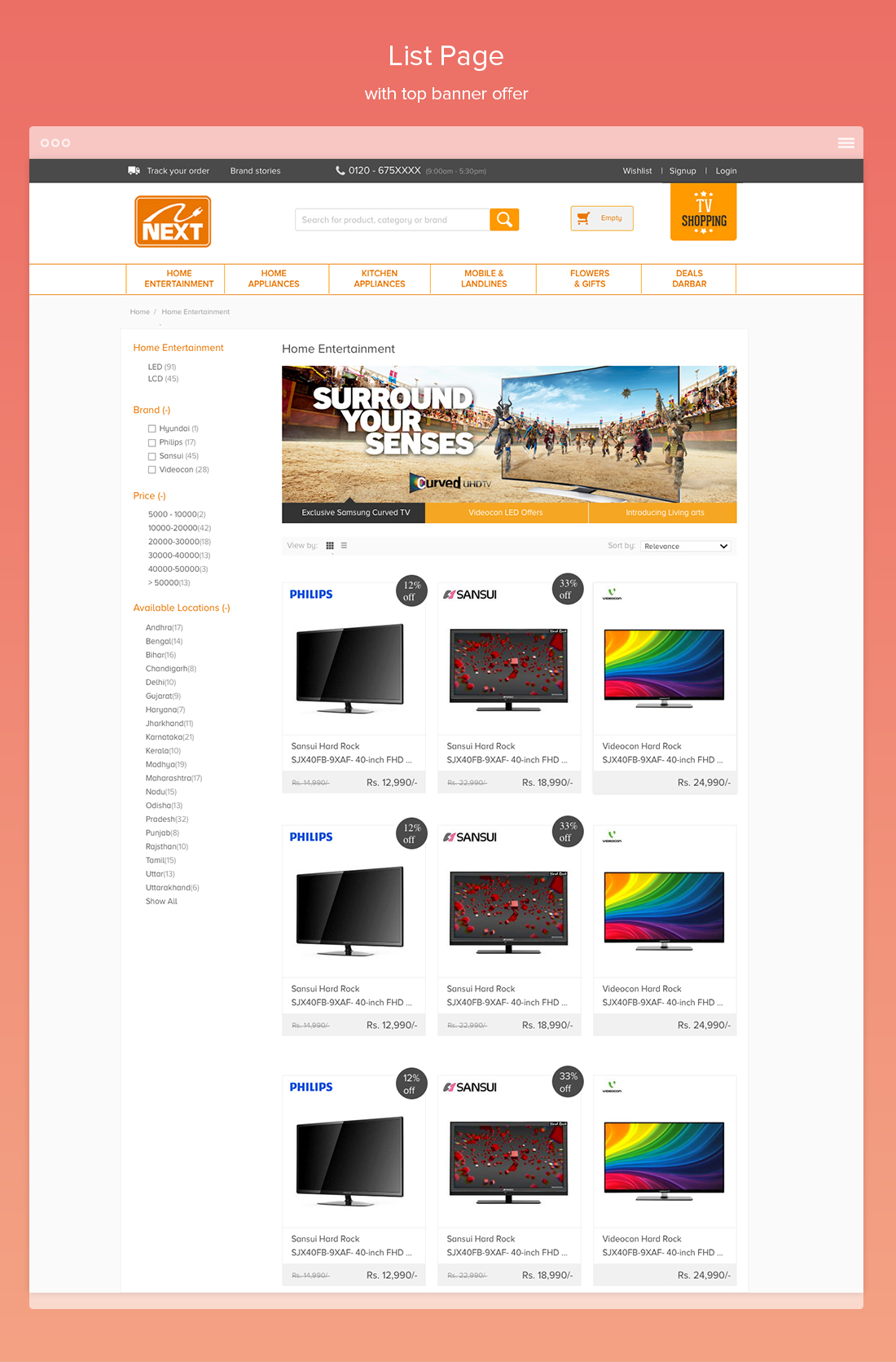
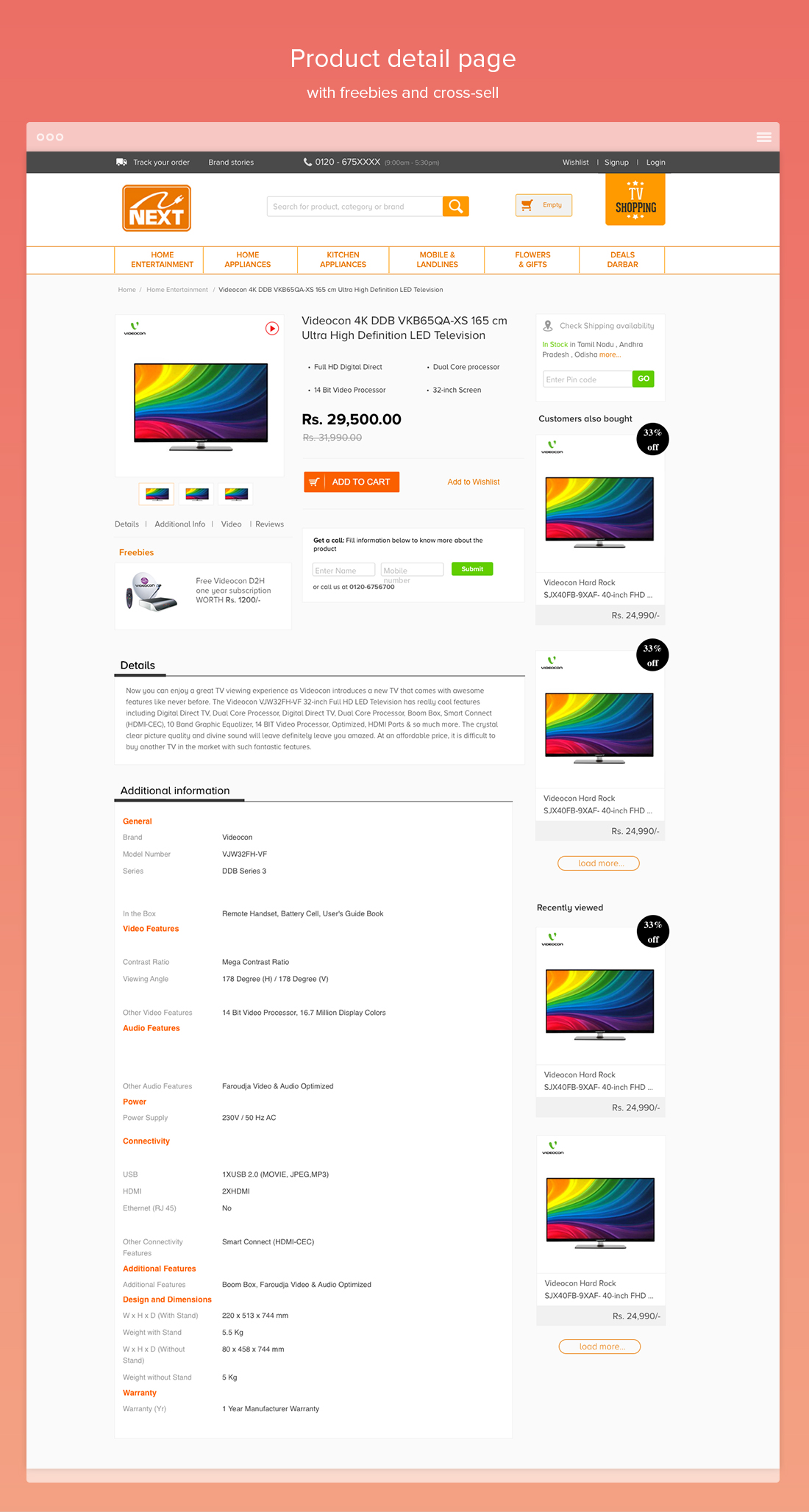
Process
Although the store was any ecommerce store but we wanted to focus on health and fitness. Also we wanted to users to explore sports and outdoor activities.
Heuristic Evaluation
I started the work by evalutaing the existing website, apart from me I asked other design colleague to evaluate the existing webiste. Also during my initial discussions with the team I got to various key inputs from the design team.
Also I went through many other major ecommerce sites Indian as well as sites with similar concept of offline as well as online presence. Initially we had a plan of a minimal integration of offline and online store, but we kept it a later stage.
Survery/Questionnaire
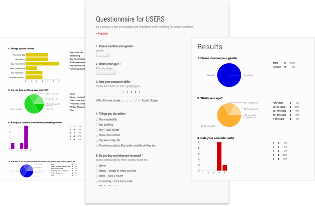
I conducted an online survey/questionaire to find key issues about the existing shop. I wanted to check existing issues users had or any common issues they witness in day-to-day tasks. Also what they think might be existing issues with the webstore. Also this excercise helped me to understand 'NEXT' a little more.
Persona
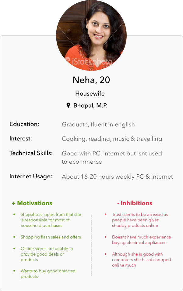
Based upon my interviews with stakeholders and initial review I created persona based upon user profiles and my initial user research. The personas helped us to evaluate deisgn solutions and new fetaures.
Categorization/ Sub-categorization
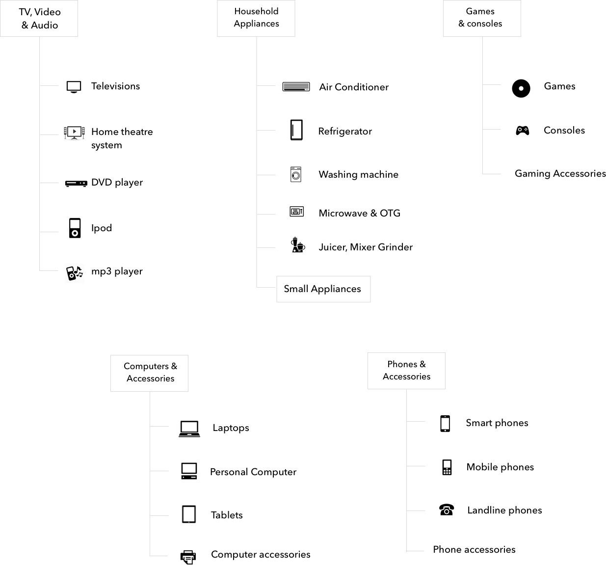
I had to restructure the entire categorization as the current one was confusing which was in our initial design feedback. Also there were duplication of many categories which confused the end user. Mobile phones and accessories which were very poular was locked in Computer, laptops and more.
We wanted to keep a simple and clear separation of categories so that it doesnt confuses the end users. As we kept on adding certain other categories we had to restructure it.
Wireframes
I started initially mocking on the paper mocks up to decide on layout and other details. I finally created wireframe using Powerpoint as we had a tight schedule and creating interactive high-fidelty mocks was time consuming. Also powerpoint allowed me to showcase the design more quickly. Also the basic checkout flow in ecommerce is almost standard so I didn't have to re-work on that entire flow.
Also we worked in agile manner any minor feedback or flaws were corrected in the development cycle itself. Also I worked on a minimalist documentation so that it can be shared for further development. Documentation included image dimesions, offer banners and other details which needed to share to external partners.
Final Design

